Connect Garmin and Strava to Notion: My Running Dashboard
A runner combined Garmin, Strava, and Notion into a personal training intelligence stack using Python scripts, webhooks, and a static HTML dashboard. The system revealed key insights: threshold runs were too intense, ACWR guided safe load increases, and polarized training zones were validated—turning raw data into actionable decisions.
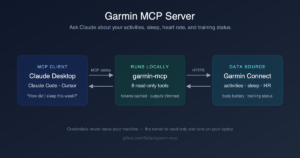
Here’s how to connect Garmin Firstbeat and Strava into a Notion training database, plus a single-page dashboard that turns the raw data into decisions. The stack has three layers — Notion as the source of truth, Garmin for physiology, Strava for ground-truth GPS — held together with a small Next.js + Supabase integrator that runs on Vercel, a Python CLI for ad-hoc queries, and one static HTML file for the daily view.
If you arrived here searching for “Garmin to Notion” or “Strava Notion integration,” most of what surfaces in those SERPs is either a paid template, a Zapier-style integration, or chloevoyer’s garmin-to-notion repo. This is the version I actually run in production — born from three stagnant strength years, a four-point drop from my VO₂max peak, and being tired of staring at three apps and feeling no smarter. Wiring them together gave me a personal running intelligence stack that tells me what to do next, not just what I did yesterday.
Here’s what’s in each layer, why it’s structured this way, and how to get the code.
The three layers
The stack has one job: turn raw data into decisions. It does that in three layers.
1. Notion — the spine
Every workout — running and strength — lives as a row in a Notion database called Øktlogg (“session log”). Each row has fields for date, distance, time, pace, average heart rate, elevation, location, surface, shoe, and a link back to the planned workout from a separate Treningsbibliotek (workout library). Strength sessions get their own per-set rows in an Øvelseslogg database with weight, total reps, and RIR (reps in reserve).
Why Notion and not a spreadsheet? Two reasons: relations and views. The set-level log links to an exercise catalog, which links to muscle groups. That means I can ask “how much volume did my upper chest get last month” without moving a single row. And calendar/board/gallery views give me a different lens on the same data depending on whether I’m planning, reviewing, or just curious.
Notion is the source of truth. Everything else flows into it.
2. Garmin Firstbeat — the physiology layer
Garmin’s Firstbeat algorithms are the closest thing a non-athlete gets to a sports lab. The Forerunner watch plus a chest strap give me LTHR (lactate threshold heart rate), LT-pace, VO₂max estimates, race predictions, training load, HRV status, and acute-to-chronic workload ratio. These aren’t vanity metrics; they’re the dials that actually steer the training.
My current snapshot, pulled live: LTHR 168, LT-pace 4:15/km, VO₂max 57.1, fitness age 18. Garmin auto-detected the threshold values during a real chest-strap interval session — not from an age formula.
3. Strava — ground truth and cadence
Strava is where I cross-check Garmin and pull cadence, weekly volume, and GPS traces. It’s also the most reliable source for historical activity dumps. I talk to it through a small Python CLI in my dotfiles — strava recent, strava since 2026-03-01, strava activity <id> — backed by a long-lived OAuth refresh token.
How it’s wired together
The glue is small and boring on purpose. Three pieces:
- A Strava ↔ Notion integrator — a small Next.js + Supabase app that listens to Strava webhooks and links each activity to its planned Notion page based on time-window and similarity rules. Encrypted tokens, an inbox for ambiguous matches, OAuth for both ends.
- A fitness CLI —
stravaandgarminshell wrappers around Python that pull recent activities, daily stats, and Firstbeat values. Used inside Claude Code sessions for ad-hoc analysis (“what did my last threshold session look like”). - A static HTML dashboard — one file, no build step. A refresh script pulls 12 weeks of Strava activities and Garmin Firstbeat values, writes them to a JS data file, and the page renders charts, race predictions, and the last few sessions with notes from Notion.
That’s it. No Kubernetes, no streaming pipeline, no ML model. A handful of OAuth tokens, a few hundred lines of Python, and a single HTML file.
The dashboard
The HTML dashboard is the part I actually look at every day. A sticky chip-row at the top jumps to: status, Garmin Firstbeat panel, plan, HR zones, weekly volume, quality sessions, race predictions, latest runs, threshold history, and a glossary.
Concretely, it shows:
- Last threshold session and current LT-pace target, side by side
- Heart-rate zones with bpm ranges and pace mappings, derived from LTHR (not max HR — more accurate for steady-state work)
- Bar chart of weekly kilometres for the last 12 weeks
- Line charts of threshold pace and cadence with goal lines from Garmin
- Race predictions for 5K / 10K / half / marathon, recomputed each refresh
- Last six runs with type, note excerpt, and link back to the Notion row
- Threshold-session history with HR-cap discipline scoring
- A glossary with inline tooltips for LT1, LT2, LTHR, VO₂max, cadence, ACWR, TE — so future-me doesn’t have to re-Google
All of it driven by one JSON refresh. No login, no SaaS, no monthly subscription.
Four insights I couldn’t see before
1. Threshold is HR-driven, not pace-driven
For years I ran threshold by feel, settling at whatever pace felt “comfortably hard.” When I scanned my last seven threshold sessions side by side, every single one drifted into 171–177 bpm — over my LTHR of 168. That’s not threshold; that’s a slow VO₂ session. Now the rule is hard: HR cap 165, drop pace 5–10 s/km if needed. That single change is doing more for my aerobic ceiling than the previous six months of “hard” running did.
2. ACWR tells me when to push
Acute-to-chronic workload ratio (last 7 days vs last 28) is the single best predictor of injury risk in endurance research. Sweet spot: 0.8–1.3. Above 1.5 is the danger zone. Mine is sitting at 1.1 right now, which means I have margin to add a session without risking the kind of overuse niggle that has historically derailed my spring blocks.
3. Plateau diagnosis from physiology, not the scale
Mid-cut I hit a 10-day weight plateau and assumed metabolic adaptation. The dashboard said otherwise: resting HR was still falling (49 → 45 over five weeks), Body Battery during sleep was rising (52 → 62), and HRV stayed BALANCED. Classic adaptation looks the opposite. The real culprit was variable sleep quality driving water retention. The treatment changed from “refeed and reset metabolism” to “fix bedtime” — a cheaper and more effective intervention.
4. Polarized training, validated
Polarized training (80% easy, 20% hard, almost nothing in between) only works if your easy is actually easy. The HR-zone breakdown of my last three quality sessions vs my easy runs makes it visible: 30% / 59% in Z1 / Z2 on an easy day, vs 22% / 31% in Z3 / Z4 on an interval day. No drift into the grey zone. That’s the model working as designed — and I only know because the dashboard puts the percentages next to each other.
Get the code
The Strava ↔ Notion integrator is the most reusable piece. It’s a Next.js + Supabase app that handles OAuth for both services, encrypts tokens, listens to Strava webhooks, and links activities to Notion pages with configurable rules. It runs on Vercel.
The repo is currently in private beta — email me and I’ll add you as a collaborator on GitHub and walk you through the setup. The fitness CLI and the dashboard template are in the same kit. Expect to read code and edit a config file; this isn’t polished SaaS.
Want a lower-friction alternative first? If you only need one of the connections, these are the open-source references:- Garmin → Notion: chloevoyer/garmin-to-notion is the canonical Python project
- Strava → Notion: michaelfromorg/strava2notion, or the official Notion docs tutorial
- No-code: Zapier, Make, n8n, and Integrately all have Notion + Strava connectors
The value-add of my stack is the integration between all three sources plus the dashboard that puts the answers next to each other. If you only need one connection, the tools above are simpler. Either way, the punchline holds: the insight isn’t in any single app — it’s in the wiring between them, plus a single page that puts the answers side by side.
Indie maker and developer. Building productivity tools and writing about systems, automation, and the craft of focused work.
Want a custom Notion template?
Browse my ready-made tools or get in touch for a custom build.